
One of our readers recently passed along a couple of very interesting charts about nuclear energy as well as the nuclear energy report from which they came. The report, World Nuclear Report 2013, is well worth a more careful look, but for those who just love some interesting charts, here are the two that our ever-alert reader shared as well as a few more I pulled out:

Data Sources: AGEB 2013

Data Source: EWEA 2013

Data Source: BP 2013

Data Source: IAEA-PRIS, BP, 2013

Data Source: BNEF 2013 and WNISR original research, 2013

Data Sources: IAEA-PRIS, MSC, 2013
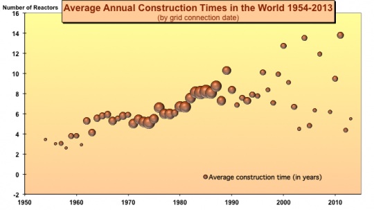
Note: The bubble size is equivalent to the number of units started up in the given year. Data Sources: MSC based on IAEA-PRIS 2013
Source: Cleantechnica http://cleantechnica.com/2014/04/22/7-interesting-nuclear-energy-graphs/#4OL7PjvFzIuuMBH4.99
You must be logged in to post a comment.